Circle Chat — Messaging Badges
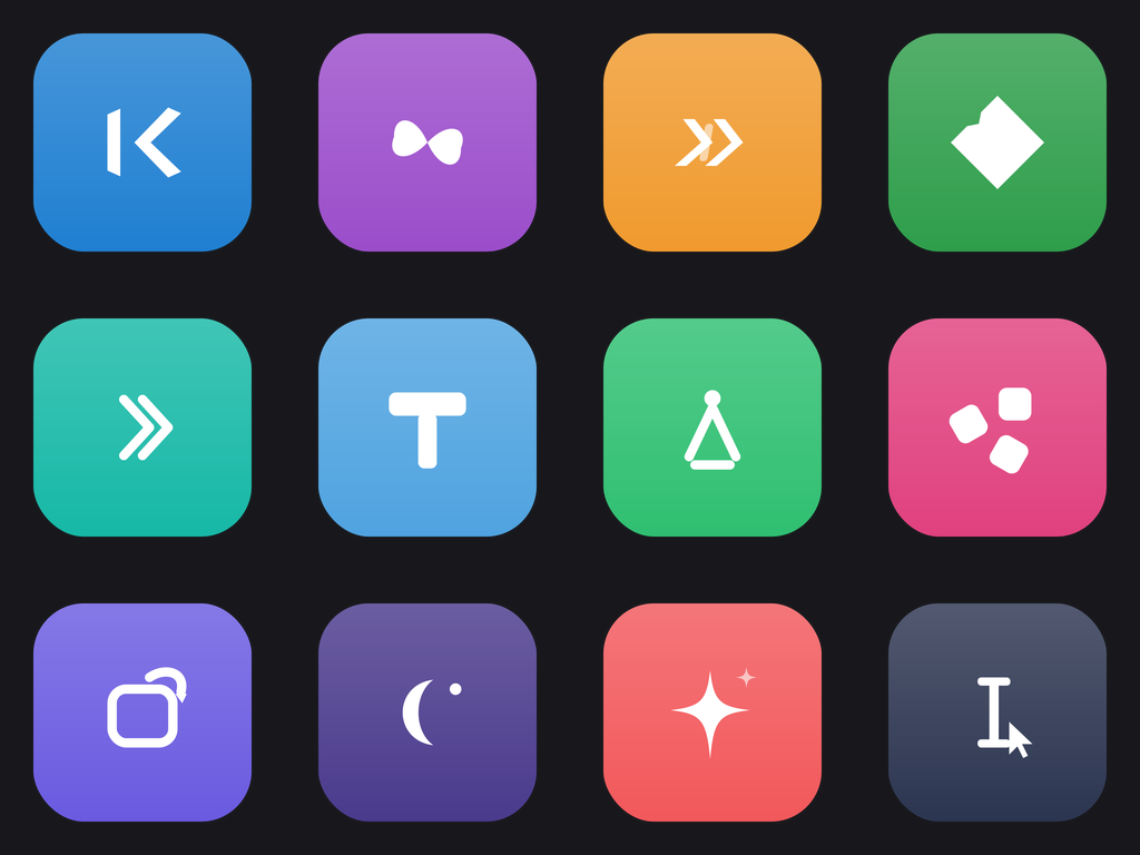
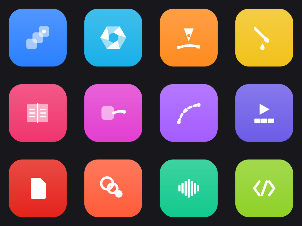
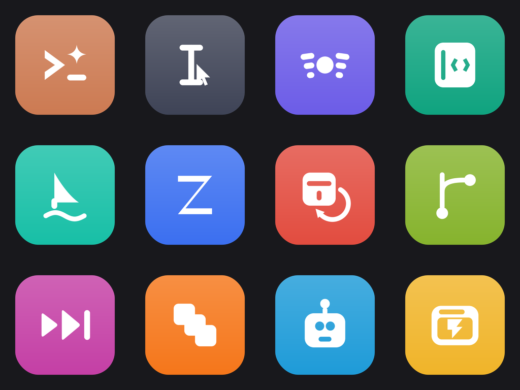
A round-badge icon set for the messaging apps people actually use, each drawn as a single white symbol on its own saturated brand-hue circle. Flat, single-weight geometry keeps all twelve reading at one optical weight whether they sit in a status dock, a contact list, or a settings row. Built for Windows desktop and web at any size.
Circle Chat — Messaging Badges
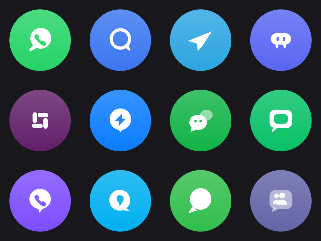
Twelve messaging apps, one shared circle. Circle Chat takes each service down to a single clean silhouette — a paper plane, a lightning bolt in a bubble, a controller face — and centers it in white on a distinct brand-colored badge. The result is a set that scans instantly as a group yet lets each member announce itself by color and mark. Ships as SVG, ICO and PNG for round-dock, taskbar and web use.
Format: SVG + ICO + PNG. Every icon ships as a transparent 1024x1024 PNG in Icons/PNG/ (the previews below), plus vector .svg source and a multi-size Windows .ico (16-256 px) bundled in one zip.
Using them: drop an .ico onto a folder via Properties → Customize → Change Icon, or onto a shortcut via Properties → Shortcut → Change Icon. The SVGs are the source art for web, docs, and app UI — they stay sharp at any size; the PNGs are there for anything that can't take a vector.
Container: circle-badge — a perfect circle badge. Every icon in the pack shares it at the same scale.
Download: circle-chat-messaging-badges-svg-ico.zip — every icon as an .svg (vector source) and a multi-size Windows .ico. The PNGs below are the previews.
Icons in this pack
- WhatsApp: A phone handset tucked inside a chat bubble reads as the call-and-message app.

- Signal: A clean tilted chat bubble stands for the pared-back private messenger.

- Telegram: A folded paper plane signals the fast cloud messenger.

- Discord: A rounded controller-face reads as the gaming chat platform's mascot.

- Slack: A four-blade pinwheel of lozenges echoes the workplace hub's hashed mark.

- Messenger: A lightning bolt inside a bubble marks the social-network chat app.

- WeChat: Two overlapping bubbles read as the all-in-one super-app chat.

- LINE: A hollow rounded-square bubble stands for the outlined-bubble messenger.

- Viber: A handset in a plump bubble reads as the call-first messenger.

- Skype: A pillow bubble with a swept notch echoes the classic call-cloud mark.

- iMessage: A plain plump bubble reads as the default green chat thread.

- Microsoft Teams: People inside a chat bubble signal the workplace collaboration app.

Prompt
Generation Prompts
- Concept model:
claude --print— claude-opus-4-8 - Glyph model:
claude --print— claude-opus-4-8 (SVG drawn directly, not an image model) - Format: SVG + ICO + PNG —
.svg(source) +.ico(Windows multi-size) +.png(1024x1024 RGBA) - Rasterizer: cairosvg, each
.icoentry rendered from the vector at its own size - Container: drawn by the generator, not the model — identical across the pack by construction
Pack Prompt
You are a senior icon designer producing a commercial icon pack for Windows desktop and web use — the kind sold on Iconfinder or posted on DeviantArt, not a stock-illustration set.
Design a cohesive pack of 12 icons on the theme: Messaging Apps — WhatsApp, Signal, Telegram, Discord, Slack, Messenger — circle badges.
This step is the concept only. You are not drawing anything yet — a second pass draws each symbol as SVG, and the container shape, the tile gradient, and the final document are generated by code. Your job is to decide what the pack is, who its twelve members are, and what colours it uses.
What a pack is
A pack is one category of similar, nameable things, drawn in one shared visual system. Think "Brave, Chrome, Edge, Firefox, Opera, Safari, Vivaldi" — or "Box, Dropbox, Google Drive, iCloud, Mega, OneDrive" — or "Photoshop, Illustrator, Figma, Canva, Affinity Designer". Twelve members of the same family, each instantly identifiable, all cut from the same cloth.
Name the real things. If the theme is browsers, name the actual browsers. If it is AI coding tools, name Claude Code, Cursor, Copilot, Codex. If it is cloud storage, name the real services. A pack of abstract inventions ("Chroma Bell", "Nebula Cloud", "Prism Home") is a failure — that is not what this is for.
But design an original mark for each. Do NOT reproduce a company's trademarked logo. Take the product's idea — what it does, its colour, its silhouette — and draw a fresh symbol for it in the pack's style. A Dropbox icon is a box or a stack of blue facets; a terminal tool is a prompt caret; a vector editor is a pen nib on a path. The set should feel recognizable at a glance without copying anyone's artwork.
If a theme genuinely has no real-world members (e.g. "Website Page Icons — Cart, Checkout, Orders"), then the 12 members are the concrete pages or functions themselves, still named plainly.
The shared visual system
Pick ONE container shape for the whole pack. The renderer draws it for you, identically on all twelve — you only choose which one fits the theme:
container |
Use it for |
|---|---|
squircle-tile |
app icons, browsers, mobile/desktop apps, AI tools |
folder-tab |
anything described as a folder pack — Windows folder icons |
circle-badge |
social, profile, status, round-dock sets |
rounded-square |
system/utility/taskbar icons, settings panels |
drive-block |
storage, backup, drives, sync services |
bare-glyph |
page/UI icons meant to sit inline in a web layout |
Colour
The pack is two-tone by design, and that is what makes it read as a set:
- Each icon gets its own
tile_color— the container behind it. This is where a member's identity lives: Firefox orange, Dropbox blue, Spotify green. Pick a saturated, distinguishable hex per icon; no two should be near-identical, and all twelve should look like one palette family rather than a random assortment. - The whole pack shares ONE
glyph_color— the symbol drawn on top of every tile. Almost always#FFFFFF; use a very dark neutral (e.g.#1A1A22) only if the pack's tiles are all pale. - For a
bare-glyphpack there is no tile, sotile_colorbecomes the symbol's own colour andglyph_coloris ignored.
Every colour must be a plain 6-digit hex string like #3B82F6.
Describing each symbol
Each icon's glyph_brief is an instruction to whoever draws it, in flat geometric terms — what shapes, in what arrangement. "A rounded upward chevron over a horizontal baseline bar" is useful; "a beautiful modern representation of growth" is not. Keep every brief phrased the same way and at the same level of detail, so the twelve come out at one optical weight.
Two hard constraints on what you may ask for, because the drawing pass is validated against them:
- No lettering. The renderer has no fonts. If a member is best known by a letter, describe the letterform as geometry ("two vertical bars joined by a crossbar") or pick a non-letter symbol instead.
- One colour per symbol. The symbol is drawn in the pack's single
glyph_color, with transparency as the only available second shade. Do not ask for a multi-colour symbol.
Return a JSON object
"title"— a catchy name for the pack."slug"— a kebab-case slug."description"— 2-3 sentences on the pack's style and what it is for."introduction"— a short intro paragraph for the pack's documentation."metadata":"style"— the visual style in a few words (e.g. "Flat vector, solid fills, single-weight symbols")."container"— exactly one of:squircle-tile,folder-tab,circle-badge,rounded-square,drive-block,bare-glyph."glyph_color"— the one hex colour every symbol is drawn in."palette"— the tile colour family in a phrase (e.g. "saturated brand hues, one per member")."keywords"— a list of 5 keywords.
"icons"— a list of 12 objects, each with:"name"— the thing itself, named plainly ("Firefox", "Google Drive", "Checkout")."concept"— one line on what the symbol shows and why it reads as that thing."glyph_brief"— the flat geometric description of this one symbol, per the section above."tile_color"— this icon's container hex.
"caption"— a short notification caption (e.g. "12 flat-vector browser icons in SVG, ICO and PNG.").
Return the JSON object and nothing else.
Drawing Contract (the glyph call)
You are drawing the SYMBOLS for a cohesive icon pack as SVG.

Pack: Circle Chat — Messaging Badges
Theme: Messaging Apps — WhatsApp, Signal, Telegram, Discord, Slack, Messenger — circle badges
Style: Flat vector, solid fills, single-weight white symbols
Container: every icon is placed by our renderer inside a perfect circle badge. YOU DO NOT DRAW THE CONTAINER, the tile, the background, or any border — those already exist. Draw only the symbol that sits inside.

## Rules — these are enforced by a validator, not by review

1. Draw each symbol in a plain square coordinate box from 0,0 to 100,100. Use the whole box; our renderer scales and centers it into the container for you.
2. Output BARE SVG shape elements only: `<path>`, `<circle>`, `<rect>`, `<ellipse>`, `<polygon>`, `<polyline>`, `<line>`, `<g>`. No `<svg>` wrapper, no XML declaration, no comments, no markdown fences.
3. **No `<text>` or `<tspan>`, ever.** The rasterizer has no fonts — a text element renders as nothing. If an icon needs a letterform, draw the letter as filled `<path>`/`<rect>` geometry.
4. No `<image>`, `<script>`, `<style>`, `<foreignObject>`, and no `href`/`src` pointing anywhere external. Nothing may be fetched at render time.
5. Colour: the symbol's default fill is already set to `#FFFFFF` by the renderer, so plain shapes need no fill attribute. You MAY set `fill="#FFFFFF"` explicitly, or use `fill-opacity` between 0.35 and 0.75 for a secondary shade. Do not introduce any other colour — one symbol colour plus its own transparency is what makes the pack read as a set.
6. Prefer solid filled shapes over strokes. If you do stroke, use `stroke="#FFFFFF"` with `stroke-width` between 6 and 9, plus `stroke-linecap="round"` and `stroke-linejoin="round"` — and use the SAME stroke width on every icon in the pack.
7. One optical weight across all twelve. Same visual density, same corner treatment, same level of detail. This is the single most important property of the set.

## Output format

For each icon, one delimiter line then its markup, nothing else:

=== ICON: <slug> ===
<path d="..."/>

Emit all 12 icons, in the order listed, using exactly the slugs given.

## The icons

- `whatsapp` — **WhatsApp**: A rounded speech bubble with a short tail at the lower-left, a stylized curved phone handset centered in its negative space.
- `signal` — **Signal**: A rounded speech bubble tilted slightly right, with a small triangular tail at the lower-right and a plain hollow interior.
- `telegram` — **Telegram**: A folded paper airplane pointing toward the upper-right, one straight top edge and a notched swept-back tail.
- `discord` — **Discord**: A horizontal rounded capsule head with two oval eyes and two short rounded prongs descending from its lower edge.
- `slack` — **Slack**: Four identical rounded lozenges arranged pinwheel-fashion around a central gap, each rotated ninety degrees from the last.
- `messenger` — **Messenger**: A rounded speech bubble with a short tail at the lower-center, a lightning-style bolt cut into its negative space.
- `wechat` — **WeChat**: Two overlapping rounded speech bubbles, a larger one in front carrying two dots and a smaller one behind at the upper-right.
- `line` — **LINE**: A rounded-square speech bubble with a short stub tail at the lower-left, drawn as a thick even outline with a hollow center.
- `viber` — **Viber**: A plump heart-rounded speech bubble with a short tail at the lower-center, a tilted phone handset centered in its negative space.
- `skype` — **Skype**: A rounded pillow-shaped bubble with a small pointed tab at the lower-right, a swept comma-shaped notch cut from its center.
- `imessage` — **iMessage**: A solid plump rounded speech bubble with a single short tail at the lower-left and a plain filled interior.
- `microsoft-teams` — **Microsoft Teams**: A rounded speech bubble containing two overlapping head-and-shoulder person shapes, a larger one front-center and a smaller one behind at the left.
More from Icon Packs